How to create Funnel Chart
Using Drag & Drop
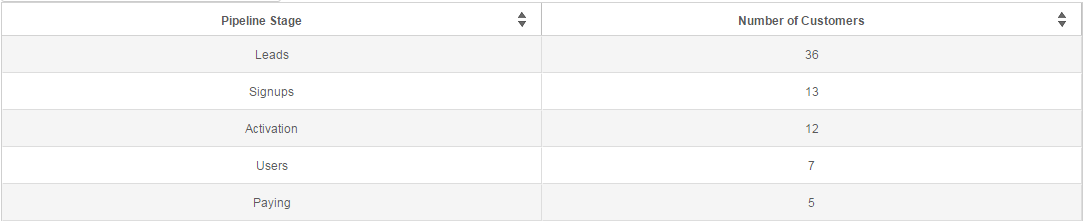
Drag one field in X-axis box and one numerical field as Y-axis box to plot a funnel chart. The column in x-axis box is used to create the funnel layers (e.g prospects, leads, closed deals, etc). The column in y-axis is used to measure values (count of customers, revenue, sales, etc)

Using SQL:
Create a select query such that first column is the funnel layer (e.g prospects, leads, closed deals, etc) and the second column is the value you are measuring for each funnel layer (count of customers, revenue, sales, etc)
Once you obtain the data, select the funnel visualization

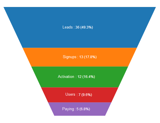
Using the checkboxes below the chart, you can customize funnel chart to show each layer as a) Percent of Total b) Percent of first stage c) Percent of preceding stage