How to create a chart
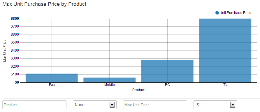
Just select a database, type an sql query & click Run Query. Chart Preview will render your chart. You will see charts being generated on the fly. Change type of chart by clicking on the list of chart types below the boxes (Table, Line, Bar, etc).
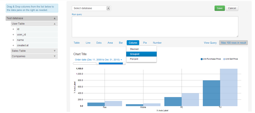
Chart Creation page is divided into 4 sections:
- Field List
- SQL Pane
- Visualization List
- Chart Preview
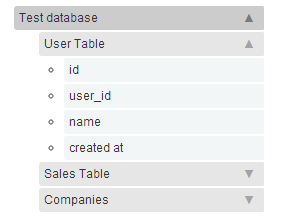
Field List
It is located on the left side of the page. It lists all the fields present in all the data sources in the project. The fields are listed as collapsible dropdowns. The fields are grouped by tables. Within each table, they are further grouped by their data types. Tables are grouped under the data source name assigned to the database connection. E.g, Test Database is the name of the data source (database), Test Table is the name of a table in the database, and the fields in this table are present under groups of Text, Number & DateTime.
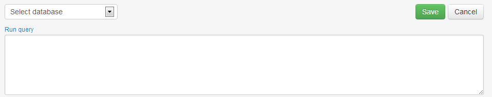
SQL Pane
It is located to the right of Field List, to the top. The fields listed in Field List can be dragged and dropped into the different placeholders of Data Pane.
To begin creating a chart, just select a database, type an sql query & click Run Query. Chart Preview will render your chart.
Visualization List
It is located to the right of Field List, below the Data Pane. It can be used to toggle between different types of display types like Pie Chart, Bars, Columns, etc. You can use this to see how your data will look like.

Please note, within Area, Bar & Column charts, you have the option of creating Stacked or Grouped charts. To read more about visualization types, please refer to Visualization Types
Chart Preview
It is located to the right of Field List, below the Visualization List. Any time you drag and drop a new field or modify individual column settings, it updates in real time to display the visualization based on the data fields & visualization that you have selected. This provides the closest representation of how a chart will look like in your dashboard.
You can customize Chart Title, Axes Labels & Formats. To change the chart title, just click on the chart title. A textbox appears in its place. You can type in the new title and press Enter key. You can update the Axes Labels & Formats by entering the required values in the Chart controls for the same, below the chart.

To learn more about chart customization, please refer to Chart Customization
Please note, the chart preview fetches a maximum of 100 rows to plot the chart. However, the actual charts in dashboards have no row limit.
Saving Charts
You can save a chart by clicking Save button. You will see a form asking you to optionally select a dashboard where you may want to pin the chart. If you have not created any dashboard, or do not want to save the chart to a dashboard yet, you can directly click the Save button on the form. Later, you can pin it to a dashboard while editing a chart.
Editing Charts
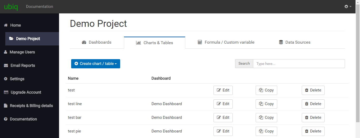
You can edit a chart by clicking on Edit button against the chart, on the Charts tab. You will be directed back to the Chart Creation page pre-populated with previously saved values.
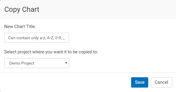
Copying Charts
You can copy a chart by clicking on Copy button against the chart, on the Charts tab. You will see a form where you can enter the chart name for the new chart and click the Save button. Please note, if you are copying a drill down chart, then the new chart will have the same parent as the old one. You read about Drill Down charts here.