Business dashboards give you at-a-glance status of your business and deliver actionable insights. Here are the key dashboard design principles you can use to build successful dashboards for your business.
Key Dashboard Design Principles for Successful Dashboards
Here are the key dashboard design principles for successful dashboards.
1. Design Dashboards with a Purpose
One of the best dashboard design principles is to simply understand what your audience wants, and provide it to them.
Who will use your dashboard? Is it a team, a department, or the whole company? Be clear about your dashboard’s target audience.
What do you want your dashboard to accomplish? Deliver insights, report performance against goals, or simply help monitor day-to-day operations?
Once you know who will use your dashboards and why, you can determine the metrics you want to display in your business dashboard.
Bonus Read : Top Content Marketing KPIs & Metrics
2. Keep it Minimal
Dashboards are meant to help users get insights quickly. So display only up to 15 important metrics & KPIs in your dashboard, otherwise it will appear to be cluttered.
Also, dashboards can be visually heavy, with all the graphs, numbers & colors. So use only up to 3-4 colors consistently, for all your graphs & charts in a dashboard. It will make your dashboard look consistent.
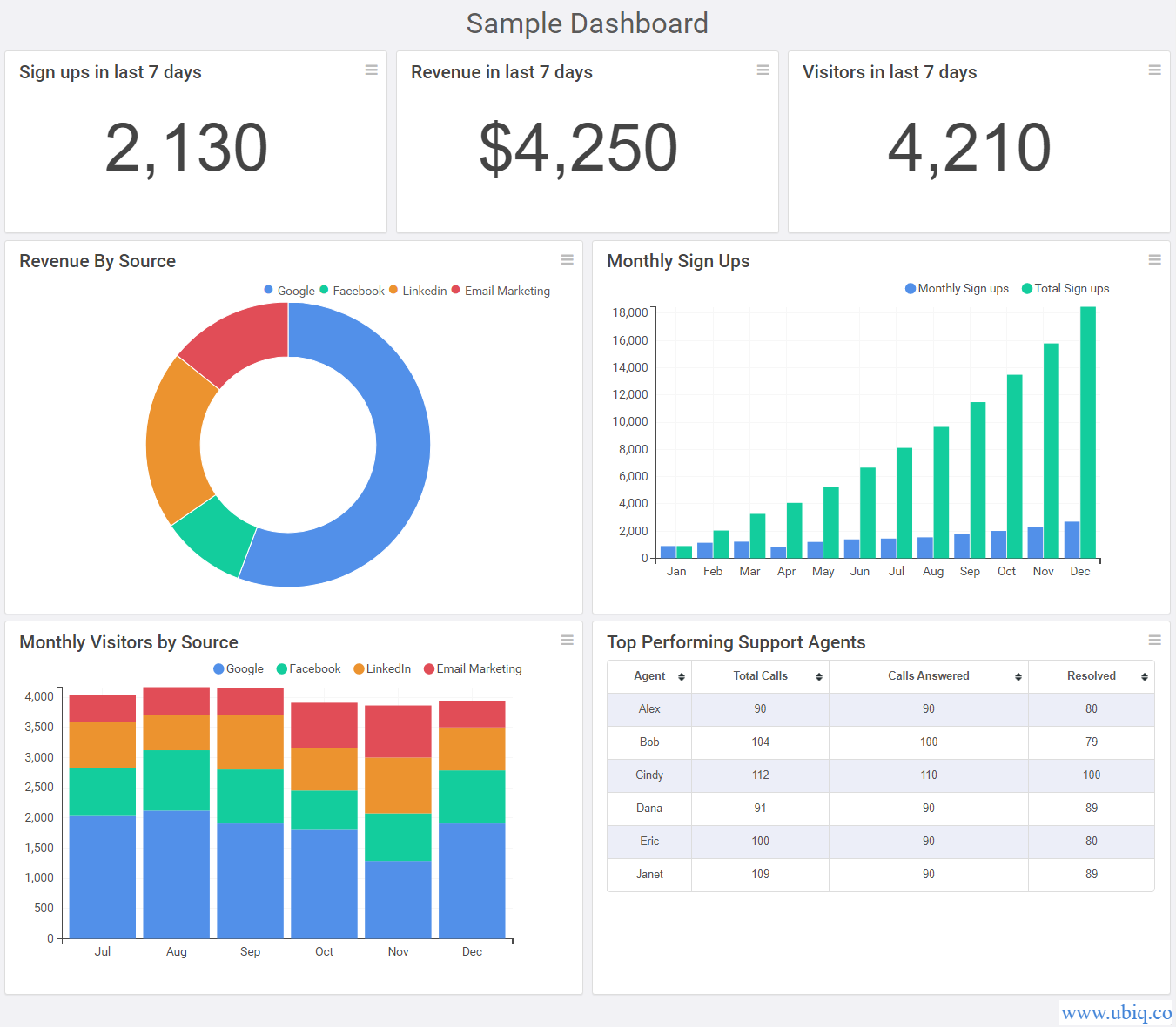
Otherwise, it will distract viewers and prevent them from analyzing data. Here’s an example of dashboard created using Ubiq

Here’s a tool to generate dashboard color palette.
3. Organize your metrics
One of the most effective BI dashboard design practices is to simply organize your dashboard metrics & KPIs from top to bottom, in decreasing order of importance.
Since viewers are used to looking at top left corner of your screen, place your most important metrics at the top left corner of your dashboard.
Bonus Read : What Makes a Good Dashboard
4. Clearly mention the context
Dashboard is a collection of tables, graphs & numbers. But they are ineffective without the right context.
So make sure that you clearly describe the context of each metric & KPI. It will help viewers easily consume information and draw insights.
There are some simple dashboard design principles to help you add context to your metrics
- Use descriptive titles for widgets. E.g “Sales Trend for Past 30 days” is better than “Sales Trend”
- Use legends, axes labels and data labels (where possible)
- Add footnotes to display caveats and assumptions
Bonus Read : Top Project Management Metrics & KPIs
5. Group related metrics
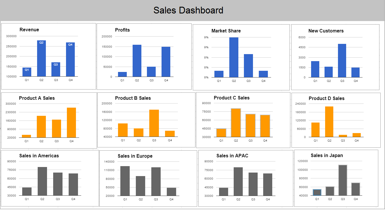
If your metrics are related to each other (same product, brand, territory, etc) then place them next to each other on your dashboard. You can also use same colors for related metrics.
These dashboard design principles will group them logically and help viewers draw comparisons and get insights.
Here’s a simple of such a dashboard

Bonus Read : Top 5 Retail KPIs & Metrics to Monitor
Hopefully, the above dashboard design best practices & tips will help you build insightful dashboards for your business.
Ubiq makes it easy to visualize data in minutes, and monitor in real-time dashboards. Try it Today!
Sreeram Sreenivasan is the Founder of Ubiq. He has helped many Fortune 500 companies in the areas of BI & software development.