Business Intelligence best practices can help you drive BI projects in the right direction. They can help you lay solid foundation for your BI systems and do course correction quickly. Here are the key business intelligence best practices for dashboard design.
Business Intelligence Best Practices for Dashboard Design
Here are the top 6 business intelligence best practices for dashboard design.
1. Gather Dashboard Reporting Requirements
The most common reason why BI projects fail is due to poor requirement gathering and analysis. Make sure that you have clearly identified the key stakeholders, decision-makers and end users for your BI dashboards.
Find out what information they need to do their job better, the shortcomings with their existing reports & dashboards.
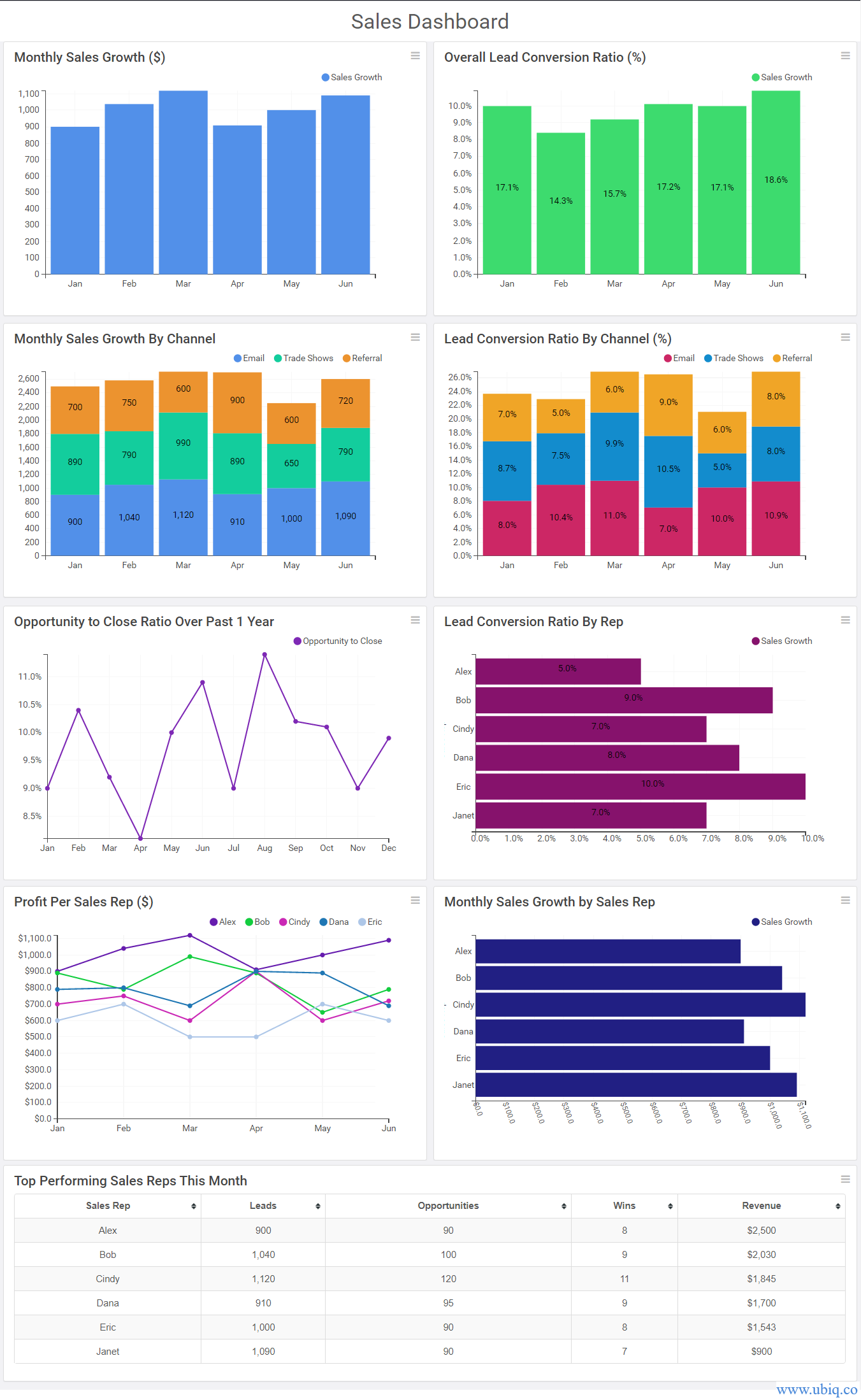
Create simple dashboard mockups using a BI solution and get a sign-off from the decision-makers after 1-2 meetings & iterations. Here’s a sample sales dashboard built using Ubiq.

Also read, our step-by-step approach to gather reporting requirements for business intelligence projects.
2. Know Your Audience
On of the most important business intelligence best practices is to know your audience. Who will use your business intelligence dashboard reports? Is it a data analyst, or a manager, or an executive? Senior management will look for summaries and strategic KPIs, while managers and analysts will look for fine-grain details.
How will they use your dashboard? Will they add it to a presentation, email it to their team, or project it live on a TV? Depending on the answer, you will need to deliver dashboard as PDF, excel, or live web report.
Make a list of all the different types of dashboard users for your BI project, along with all the dashboards they use, if any. Also mention the report frequency, format and mode of delivery.
Look at their current dashboards to understand what metrics to display. Ask them what more do they want to see, or which metrics they would like to change/drop.
3. Choose the Right Type of Dashboard
Did you know there are 3 main types of business dashboards – strategic, operational and analytical – each meant for a different audience and serves a different purpose. Most dashboard reporting software allow you to build all types of dashboards.
Depending on the type of audience, make sure you pick the right dashboard type for each business intelligence dashboard. Otherwise, you might end up using a data-heavy analytical dashboard for summary-loving executives.
4. Display the Key Metrics Above the Fold
Identify all the metrics & KPIs that you need to display for each user. Organize them into dashboards such that they are logically grouped. You can group them based on business area (e.g marketing KPIs, financial KPIs, etc) or products, or even management level (e.g executive, manager,analyst).
One of the key dashboard design best practices is not to clutter your dashboards. Build a dashboard for each group of KPIs. While doing so, use only 10-15 metrics per dashboard. If there are more KPIs, create auxiliary dashboards to accommodate them.
In each dashboard, make sure you display the top 4-5 key metrics above the fold of your screen, and the rest below.
5. Choose the Right Visualization for Each KPI Metric
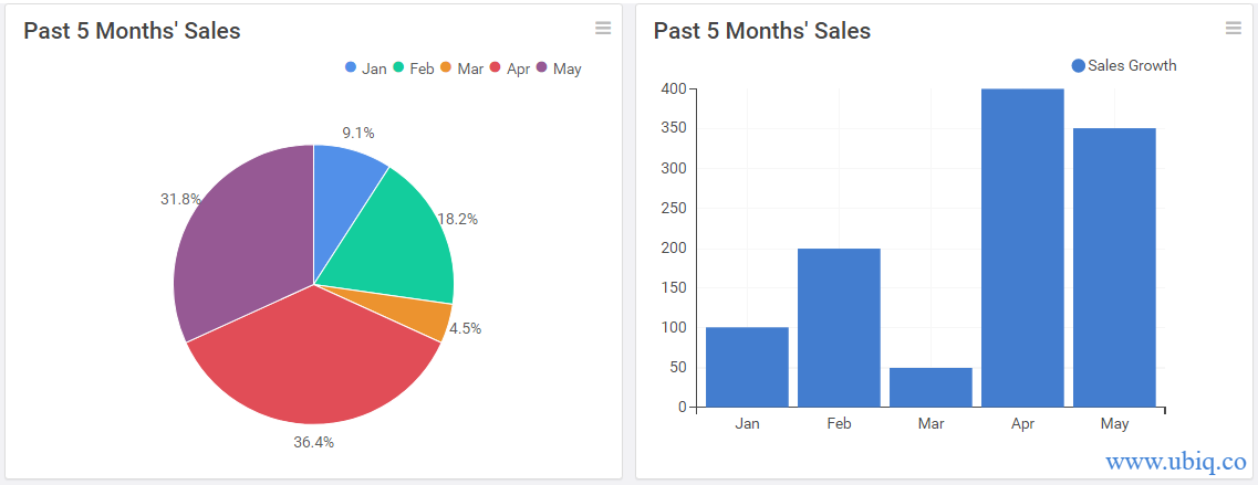
When you use a data visualization tool, one of the key design guidelines for dashboards is to use the right visualization for each metric. Otherwise, you might confuse your audience. Look at the example below. In which visualization is it easy to understand the sales trend?

The sales trend is obvious in the column chart, while in case of pie chart, you’ll end up wasting time between pie slices and the chart legend.
Similarly, use an appropriate color palette to make your dashboard look professional. Find out if your brand colors can also be used in your dashboards.
6. Add Relevant Context
Make sure the audience can easily understand your each metric, by adding relevant context to each visualization, via chart titles, data labels, axis labels, footnotes, etc. This will help users see those numbers in the right perspective. Adding the right context is one of the most effective business intelligence best practices, often ignored.
Which of the following visualizations is more informative?

Hopefully, these business intelligence best practices for dashboard design will help you build intuitive & insightful dashboards for your audience. If you want to create business dashboards, reports & charts, you can try Ubiq. We offer a 14-day free trial!
Sreeram Sreenivasan is the Founder of Ubiq. He has helped many Fortune 500 companies in the areas of BI & software development.