Business dashboards help users to transform data into insights and make better decisions. If your dashboard has the right features, they will only make it easier to understand your data and grow your business. Here are the top 5 dashboard features to take your business dashboards to the next level.
Top 5 Dashboard Features for Business Dashboards
Are you wondering what to include in your business dashboards? Here are the 5 key dashboard features to help you design stunning dashboards for your business.
1. Dynamic Filters
Also, known as dashboard filters or chart filters, dynamic filters is one of the most important dashboard features. Dynamic filters allow users to dynamically filter the data used in one or more dashboard widgets, enabling users to slice & dice data on the fly.
Dynamic filters are not only interactive but very useful.
Also, users don’t have to build separate charts for each value of your dynamic filter. Here’s an example of a dropdown filter.
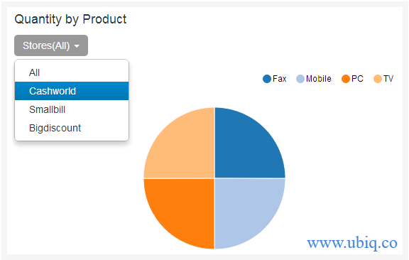
In the above example, the default chart displays overall data for all stores. When user selects a store name from dropdown, then it will display data for only that store.
Bonus Read : How to Choose Best Business Intelligence Software
2. Drill-downs
Drill-downs are one of the most popular dashboard features that allow users to dig deeper into their data and get more insights, from one place. Drill-down consists of two charts – a parent chart and a child chart. When users click on parent chart’s data point (e.g pie slice, line, bar, etc), the dashboard automatically, renders the child chart with values specific to that data point.
Here’s a sample pie chart that displays citywise sales data in a pie chart.
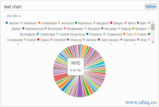
When a user clicks on a pie slice such as NYC, he/she sees NYC’s data in another chart.
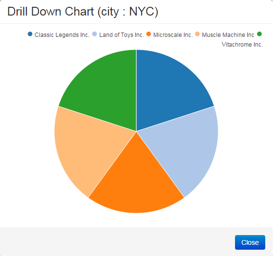
Drill-down charts allow users to explore and investigate deeper into their data, and get more insights, without building additional charts.
Bonus Read : Financial Dashboards & Reports : Benefits, KPIs & Metrics
3. Dynamic Text boxes & Section Headers
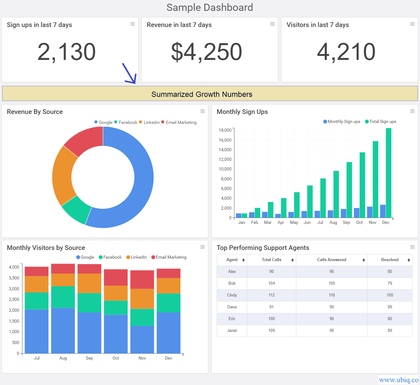
Many times you may need to group dashboard charts and reports logically to make it easier for users to understand information.
Sometimes you may also need to add custom notes and texts to highlight key insights, caveats & assumptions about your data.
Dynamic text and headers allow you to present information with better context.
Here’s an example
Bonus Read : How to Create Operational Dashboard for Business
4. Scheduled Email Reports
Business dashboards are most effective when they are shared across a team of users. However, everyone may not be able to log into your dashboard software to review live dashboards.
So you should be able to schedule automated email reports to your users as PDF/Image. This will allow them to access insights from anywhere, at anytime.
Scheduled email reports are especially useful if you are creating executive dashboards, since most executives are too busy to manually log into dashboards.
On a similar note, users should be able to export dashboards as PDF, Image, and other formats. These features make it easy to deliver insights to end users and result in faster decisions.
Bonus Read : CTO Dashboards & Reports : Benefits, Examples & KPIs
5. Tooltips & Data Labels
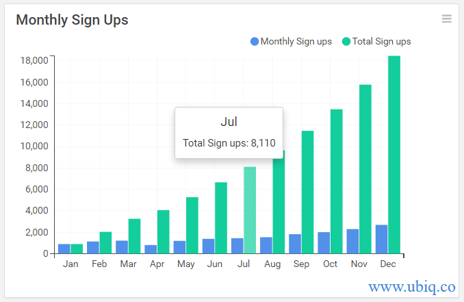
Tooltips and data labels allow users to easily understand the precise value of data points without making any guesses.
Most tooltips are displayed by simply hovering mouse pointer over a data point. Here’s an example.
If you have the above dashboard features in your business dashboard, it will make your team’s life a lot easier.
Ubiq makes it easy to visualize data in minutes, and monitor in real-time dashboards. Try it Today!
Sreeram Sreenivasan is the Founder of Ubiq. He has helped many Fortune 500 companies in the areas of BI & software development.