Effective dashboards help you get at-a-glance status of your business and make better decisions. Here are 5 Key principles of Effective dashboards that you can use in your dashboard development process for dashboard design, or just as general-purpose dashboard design tips and best practices.
5 Key Principles of Effective Dashboards
Here are 5 key principles of effective dashboards that you can use.
1. Know Your Audience
One of the most important principles of effective dashboards is to know your audience thoroughly. Find out
- Who will use your dashboards?
- Why do they need these dashboards? How will it help them?
- How frequently will they use your dashboards? Daily, weekly, monthly?
- How will they access it? Via email, web portal, TV screen, mobile app, laptops?
- What do they want to see on their dashboards?
- Do they already use some reports, charts & dashboards? If so, ask them for a copy.
Talk to your target audience over a couple of meetings, document these requirements, make a list of all dashboards to be built, along with their end users. Take a sign off. Otherwise, you will waste a lot of time iterating on gathering reporting requirements.
2. Focus on Your Message
Each business dashboard is meant to inform end users of something. It may be about evaluating their strategy, or exploring new growth areas, or identifying areas that need improvement.
Whatever the business objective, ensure that you focus on it while designing dashboard, and choose your metrics accordingly. For example, if a Marketing VP needs a dashboard to simply monitor social media campaigns, then there is no point in including something like ’email open rate’ in that dashboard.
Similarly, if your audience is looking for high-level trends then you should probably avoid displaying data-heavy tables and stick to charts & graphs.
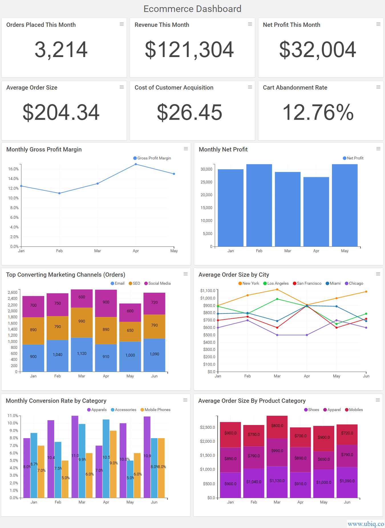
Your target audience must be able to get what they are looking for within 5-10 seconds of looking at your dashboard. Here’s an example of an Ecommerce dashboard built using Ubiq BI Solution, that shows key numbers at the top, followed by high-level trends to give at-a-glance status of business from one place.

3. Arrange Metrics Logically
One of the best principles of effective dashboards is to simply arrange your metrics in a logical manner so that it becomes easy for your audience to consume information.
Don’t include more than 10-15 charts & graphs on your dashboard. If you need to display more metrics, push them to another ‘auxiliary’ dashboard.
Organize these metrics as 3 layers. The top layer must contain the most important numbers about your business/department/process, or whatever your dashboard is about.
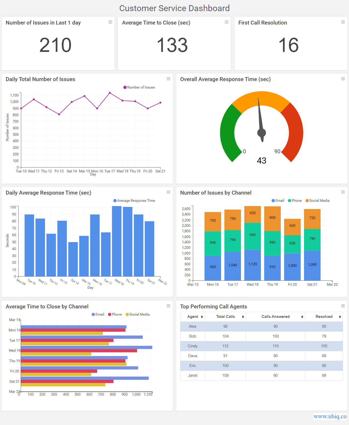
The middle layer must contain trends and graphs that expand on the above numbers. The bottom layer can contain more similar graphs, or more detailed tabular data. Here’s an example of such an enterprise business dashboard that you can create using our dashboard software.

Similarly, place related metrics near each other so that users can easily draw comparisons, get insights quickly and make decisions faster.
4. Make it Easy to Use
One of the most ignored principles of effective dashboards, it to make it easy to use. First of all, add relevant context to each dashboard widget by adding chart titles, axis labels, data labels, footnotes and comments. Look at the 2 following visualizations. Which one is easy to understand?

Similarly, use filters and drill-downs to make it easy for users to slice & dice data, and discover new insights. Most BI solutions offer all these features out-of-the-box.
5. Use colors sparingly
Dashboards are highly visual elements. If you use too many colors in your dashboard, it will only distract, confuse and misguide your users.
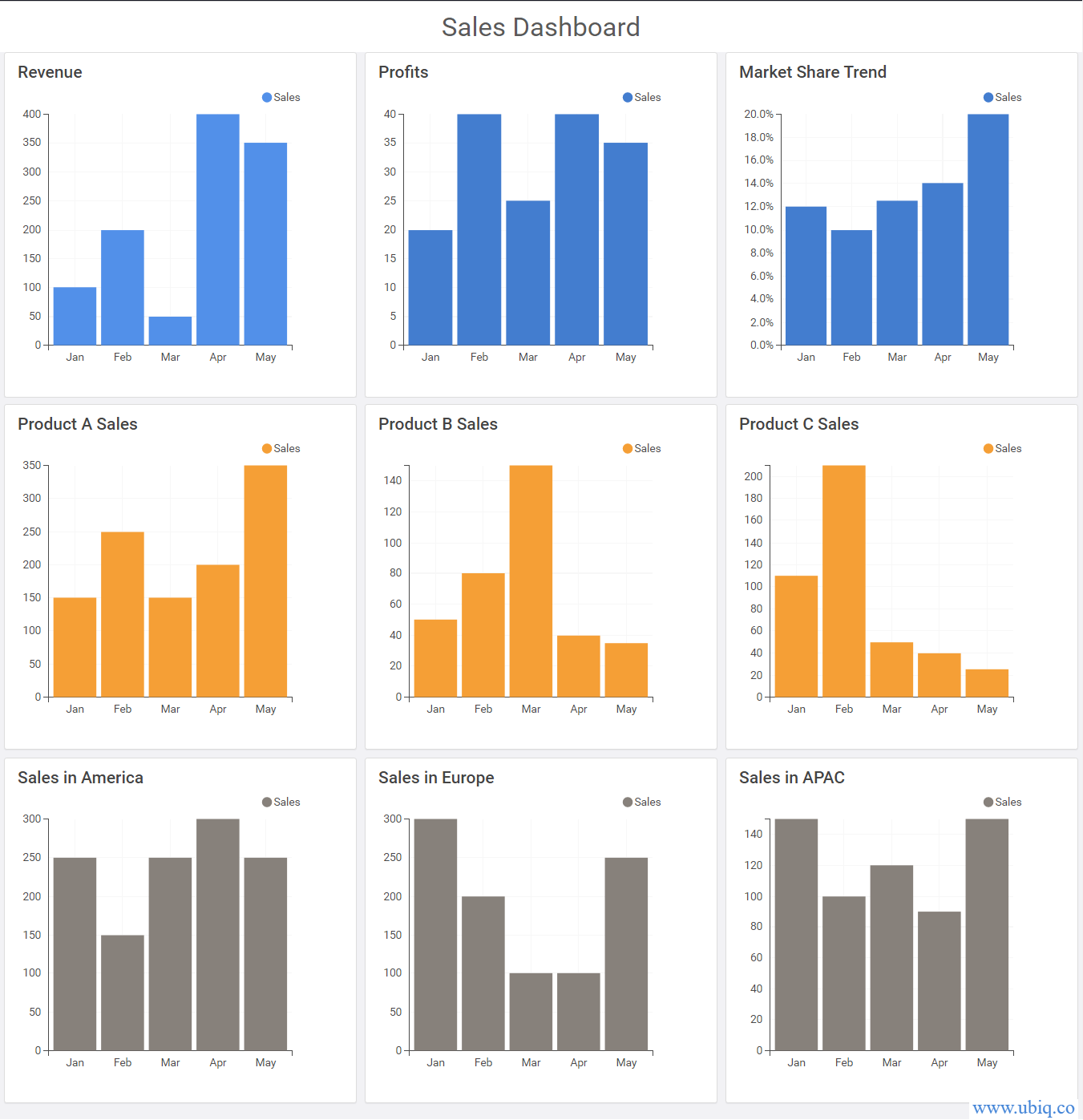
Here’s an example of a business dashboard created with our web-based reporting tool, where we have used colors sparingly but in such a way as to group similar metrics, so that audience can easily understand the data, see relations, make comparisons and draw insights.

Hopefully, these key principles of effective dashboards will help you build intuitive & insightful dashboards for your audience. If you want to create business dashboards, reports & charts, you can try Ubiq. We offer a 14-day free trial!
Sreeram Sreenivasan is the Founder of Ubiq. He has helped many Fortune 500 companies in the areas of BI & software development.