A good KPI dashboard is well-designed, easy to understand and intuitive. It enables users to spot issues and make better decisions quickly. Here’s what makes a good KPI dashboard that enables users to draw insights from data and get at-a-glance status about their business.
What Makes a Good KPI Dashboard
Here are some effective tips to help you build a good KPI dashboard for your business.
1. Relevant KPI Metrics
A good KPI dashboard quickly gives you at-a-glance status of your business. For that, it is essential that you display only relevant KPI metrics on your dashboard.
Include only the most important and/or urgent KPIs metrics that your target audience requires to achieve their business objectives.
Don’t create a single unified dashboard with all KPIs, for all your users. It will only confuse them. Group users by department/role and create separate KPI dashboards for each group.
This will make your KPI dashboard more relevant.
Bonus Read : How to Create Data Visualization Dashboard
2. Right Level of Detail
It is also important that KPI metrics are at the right level of detail, for your target audience.
Different people have different detail requirements for the same KPI metric. For example, a sales manager will be interested in daily sales trends, while a VP will be more interested in monthly/quarterly sales trends.
Although both need sales trends, they are at different levels of detail. So display KPI metrics at the right level of detail, so that users can easily draw insights and make better decisions.
Bonus Read : Top DevOps Metrics & KPIs to Monitor Regularly
3. Intuitive Layout
One of the most important components of a good KPI dashboard is an easy to understand layout. Organize your KPI metrics that makes it easy for users to spot trends, make comparisons and draw insights.
Here are some simple ways to make your layout more intuitive:
- Arrange KPI metrics logically
- Place summarized numbers & graphs at the top to quickly give a high-level view for users
- Arrange more detailed graphs & tables in the lower half of your KPI dashboard. It helps users dig deeper
- Group related KPI metrics near each other. This will make it easier for users to relate different KPIs and make comparisons. For example, place KPI metrics for each brand/product/marketing channel/team/department near each other.
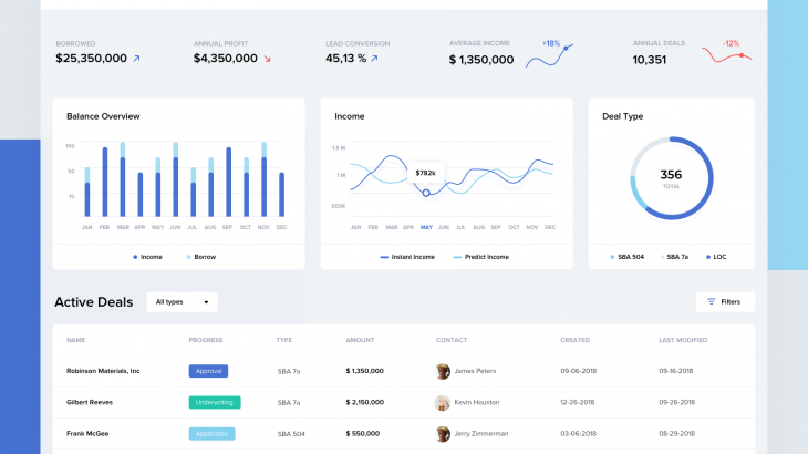
Use a dashboard software to quickly create dashboard mock ups with sample data. Here’s an example of dashboard designed in Ubiq.
Bonus Read : How to Build Effective Dashboards
4. Less Noise
Dashboards are visual elements and can be quite distracting, if not designed properly. There are two common mistakes that stop people from building a good KPI dashboard
- Displaying too many KPI metrics on a dashboard
- Using too many colors
The five second rule for dashboard design says that users should get a brief idea of your dashboard within 5 seconds. So display only upto 15-20 KPI metrics on your dashboard. Otherwise, it will look cluttered.
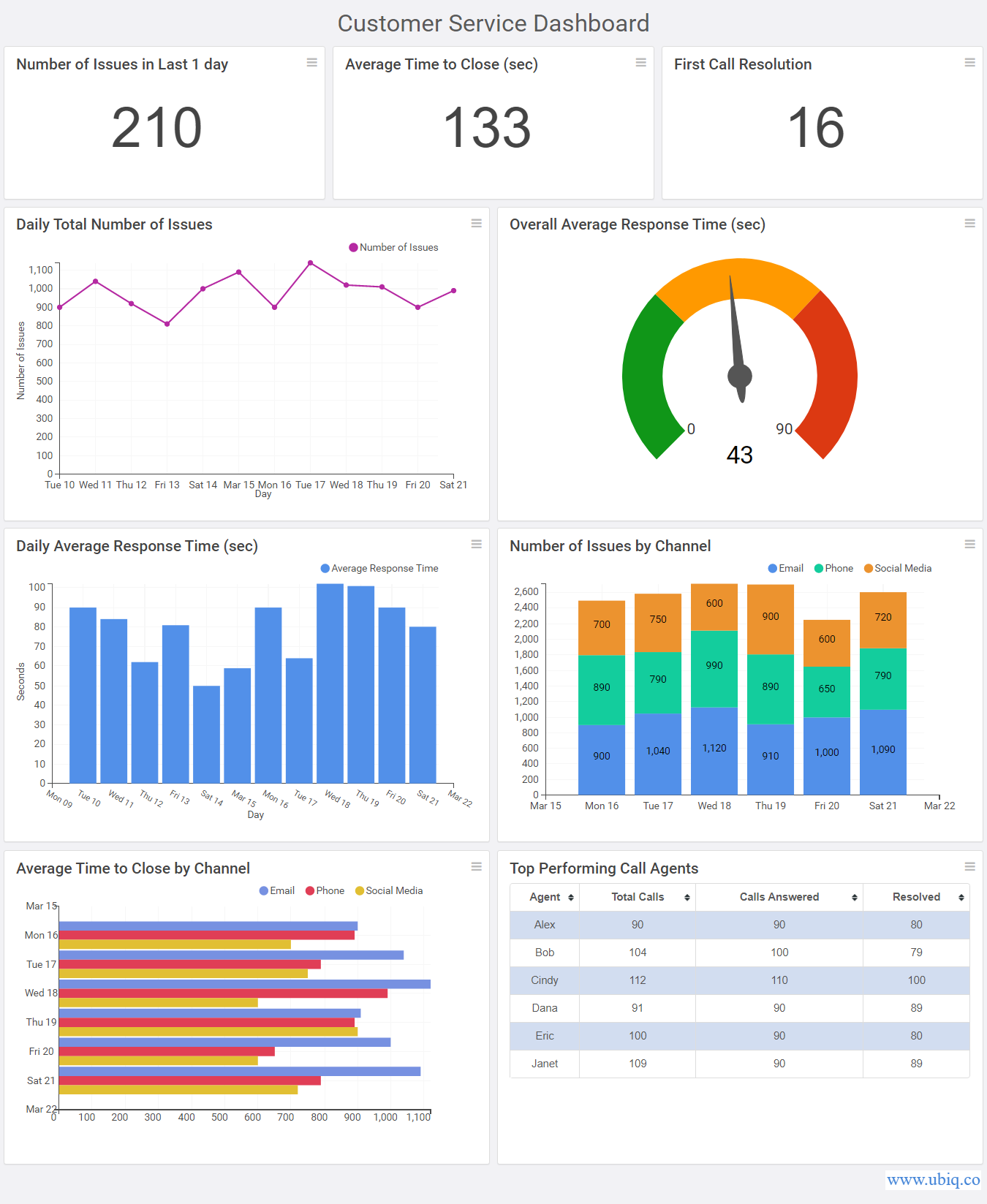
Similarly, use minimum colors consistently across different graphs & charts. That will make your KPI dashboard look more professional and coherent. In fact, you can use same colors for similar KPI metrics. It will help users spot relations easily. Here’s an example.
Hopefully, the above tips will help you design a good KPI dashboard for your target audience. If you want to create business dashboards, reports & charts, you can try Ubiq. We offer a 14-day free trial!
Sreeram Sreenivasan is the Founder of Ubiq. He has helped many Fortune 500 companies in the areas of BI & software development.