Just like the dashboard on your car tells you how fast your going and highlights any problem areas, a business dashboard tells you how your business is doing. Your business can be an E-commerce website, a SaaS product, a Mobile App or something else. A dashboard gives you immediate feedback to act upon. Here are some dashboard design best practices that you can use to build intuitive dashboards for your business.
Dashboard Design Best Practices
Business Dashboards are mainly used to:
- See if you are on track to reach your goals
- Spot new trends which can be used as opportunities
- Spot outliers & risks to be dealt with
However, different people in a company ask for different data to be displayed on their dashboards. Soon, the dashboards become hard to read and full of meaningless non-related information. When this happens, the dashboards are no longer useful.
Most of the time, this can be fixed just by organizing the information on the dashboards to be easy to understand & communicate. Here are a couple of dashboard design best practices to design your dashboards to cut through the clutter & get insights faster. These methods are applicable for any type of dashboard and information.
Pyramid Layout
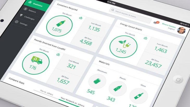
In this layout, a dashboard is based on a single theme and all the charts & numbers on it are related to each other (refer to example below). Together, they tell you a single story. E.g, it can be about sales performance, or user demographic, etc. The charts are arranged as 2-3 layers, one below the other. The amount of information present in them is like that in a pyramid.
The top layer shows the 2-3 most important numbers. No detailed information. These numbers can be the based on the goals you set for yourself. E.g, if you need to boost signups, you will need to track growth in signups over previous month, signups for current month, total signups, etc. If things are on track, you can just take a glance at them and move on.
The middle layer goes deeper and shows trends which explain these numbers. It gives more details. So if the numbers in top layer appear unexpected, you can immediately look at the charts below to look at the trends. These trends can be obtained by viewing the above numbers over time or split by a specific attribute like gender, location, age, etc in case of users.
The bottom layer can be data or trends to elaborate more about the layers. This layer is optional. This layout is effective because each chart/number has a fixed context and purpose. You know how to read it and what to look for.
People are used to consuming information in this format. You can find this layout being used in presentations, web pages, letters/emails, etc also. The most important information being at the top, each subsequent layer giving details about the layers above.
Magazine Layout
You can start out by building a single dashboard using the Pyramid Layout. As your business grows, you will have more data to look at and more questions to be answered. You may feel that information is spilling out of your dashboards. At that time, you can move towards the Magazine Layout. In this layout, you have a main dashboard which acts like the cover page of a magazine. It contains charts & numbers about different non-related themes. E.g, some information about sales, some about marketing, some about users, etc. This gives you a single place to view all the important information about your business.
In addition, you have detailed dashboards, one for each of the themes. E.g, one for sales performance, one for marketing campaigns, one for user demographics, etc. They act like the story pages in magazines. They contain detailed information about each of the themes present on the main dashboard. So if you see something interesting or confusing on the main dashboard, you can directly look into the corresponding detailed dashboard to get more information. Within each detailed dashboard, you can use the pyramid layout to structure your information as we saw above.
This approach groups similar information together and separates non-related information. It gives more clarity & efficiency. This layout is similar to the folders & sub folders we maintain on our laptops.
Generally, it’s one of the good dashboard design best practices to limit number of charts on your dashboards to 6-8. Every chart sends us a message visually. On a crowded dashboard, even important and obvious messages get lost easily.
Go ahead & try out the above mentioned dashboard design best practices.
Here are a couple of books you can read to know more about dashboard design best practices & information cognition:
- The Minto Pyramid Principle by Barbara Minto
- Information Dashboard Design by Stephen Few
Hopefully the above dashboard design best practices will help you design insightful & intuitive dashboards for your business.
Sreeram Sreenivasan is the Founder of Ubiq. He has helped many Fortune 500 companies in the areas of BI & software development.