CTO dashboards and reports give at-a-glance status of technology infrastructure and allows CTO’s to quickly identify and fix issues. Here are the key benefits, KPIs and metrics for CTO dashboards and reports.
CTO Dashboards & Reports : Benefits, KPIs, Metrics
What is a CTO Dashboard
CTO dashboard is a visual collection of key IT KPIs and metrics about your business technology and infrastructure. It is meant for CTO’s and other senior level IT executives such as VP, Product Manager, IT manager, etc.
CTO dashboard gives at-a-glance status of how your technology stack is doing, helps you measure performance, identify issues and fix them early.
Most CTO dashboards automatically gather, consolidate, analyze and report data points from various technology assets of an organization, making it easy to get insights from a wide range of data sources, and make better decisions.
Bonus Read : How to Create Operational Dashboard for Your Business
What are CTO Reports
CTO reports are basically static version of CTO dashboards. While CTO dashboards show live data, CTO reports are periodic snapshots of the same information, or more summarized data points.
CTO reports also help IT employees track performance compared to IT goals.
Mostly, CTO reports are PDF exports of CTO dashboards that are automatically emailed to key stakeholders and decision makers who are too busy to regularly check-in on live CTO dashboards.
Bonus Read : Top 5 SaaS KPI Metrics for Your Business
Benefits of CTO Dashboard
Here are the key benefits of CTO dashboards. They
- Provide Single point of information about IT infrastructure
- Collect and report data from diverse data sources
- Simplify and present data visually
- Send automatic alerts in case of issues
- Send automated email reports to key stakeholders
- Provide at-a-glance status of vital technology stats
- Can be accessed anywhere, anytime, on any device
Bonus Read : Top 5 DevOps Metrics & KPIs to Monitor
How to Create CTO Dashboard
Here are the steps to create CTO Dashboard and Report
1. Understand Your Target Audience
Find out who will use your dashboards, how and why. They may be CTOs, IT Managers, Product managers, etc. This will help you show relevant information in your CTO dashboard. For example, a CTO will need a comprehensive overview of all technology assets, while a product manager will be interested only in his/her product’s vital stats. Conduct 2-3 meetings to understand their goals, what they are in-charge of, and what metrics matter to them.
2. Identify CTO KPIs and Metrics
Understand your audience’s business goals and objectives. Find out what metrics and KPIs they use to measure their performance against these goals. Ask them if there is anything more/different that they would like to see on their dashboards.
Also, find out how they get this information (via email, web portals, PDF, etc) and how frequently they need it.
3. Design Dashboard Mockup
Once you have a clear idea of your dashboard, use a dashboard software to quickly create a mock up. Organize KPIs & metrics on your dashboard, in a top-down manner, with the most important metrics at the top, trends & distributions in the middle, and granular details at the bottom.
Make sure you choose the right visualization for each KPI metric to avoid confusing your audience.
Conduct 2-3 meetings with key stakeholders & decision makers to review your dashboard mock up, get sign off and start building your dashboard.
Bonus Read : Key Website Performance Metrics & KPIs
CTO KPIs and metrics
Here are the key CTO KPIs and Metrics you must track on your CTO dashboards and reports.
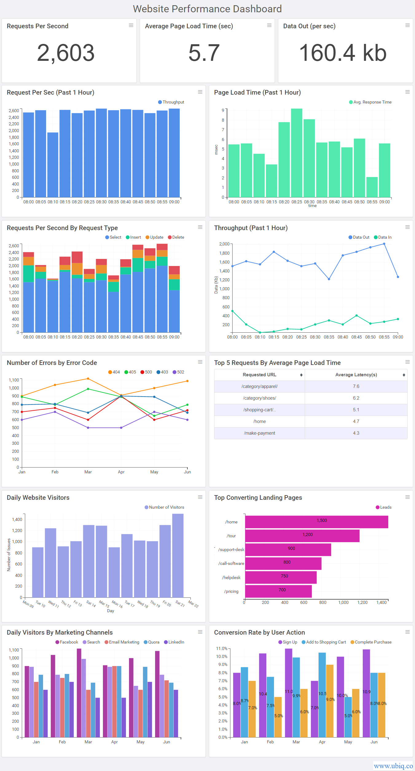
1. Requests Per Second
Requests per second measures the number of requests processed by your server per second. It gives a good idea about the server performance, concurrency and server load.
2. Throughput
Throughput is the amount of data received and sent by your website server per second. It helps you measure and optimize data costs.
3. Number of Errors
It is important to track all the errors that occur when people use your website/app. So measure the overall number of errors per day, as well as break them down by error codes to find out and fix most common errors.
4. Average Response Time
Average Response time is the average amount of time your server takes to process a request. If your website/app’s average response time is high, then it means your server is under heavy load. Monitor average response time throughout the day to find out when your server gets overloaded.
5. Top Pages with Page Load Time
Page Load time is the amount of time it takes to load a web page on your website. It is important to track the top 5 pages with most page load time, as they will increase your average response time. Identify those pages and determine if you can reduce their page load time.
6. Most Frequent Requests
It is also important to track the 5 most requested URLs to ensure there are no bottlenecks in serving them. Otherwise, they will spoil user experience and reduce customer satisfaction.
Bonus Read : Key Server Performance Metrics to Track Regularly
CTO Dashboard Examples
Here’s an example of CTO dashboard created using Ubiq.

Ubiq makes it easy to visualize data in minutes, and monitor in real-time dashboards. Try it Today!
Sreeram Sreenivasan is the Founder of Ubiq. He has helped many Fortune 500 companies in the areas of BI & software development.