Data visualization techniques allow you to design intuitive dashboards, charts & reports to get insights from data. Here are the top 5 data visualization techniques to help you get insights from data.
Top 5 Data Visualization Techniques For Your Data
Here are the top 5 data visualization techniques to help you design more intuitive graphs and dashboards for your business. You can use them with any data visualization tool and any data visualization project.
1. Know Your Audience
One of the most important data visualization techniques is to know your audience. Find out
- Who is your target audience
- What information they are looking for
- How will they use your graphs & reports
- How often will they need it
- How will it help them do their jobs better
Different people require different kind of information from a data visualization. Data analysts look for granular information while senior management looks for high level trends.
So it is important to understand your audience well so you can customize your dashboards & reports accordingly.
Also read : Top 5 Data Visualization Tools
2. Pick the Right Metrics
It is also important to figure out what KPI metrics you need to display in your data visualization. For example, an operations manager will be interested in monitoring daily number of customer complaints, while a VP sales will be interested in quarterly sales numbers.
What is important for one person, might be irrelevant for others. So it is important to find out what KPI metrics your target audience is already tracking (via internal systems, spreadsheets, etc.) and what new metrics they want to start tracking from now on.
Also read : Top 4 Data Visualization Best Practices
3. Choose the Right Chart Type
If you pick the right chart type to visualize data, that makes it easy for your audience to understand information and draw insights from it.
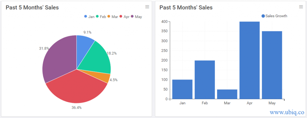
In which of the following graphs is the sales trend obvious?

The sales trend is obvious in the bar graph on your right, while the user may get lost between the pie slices and legend, in case of pie chart.
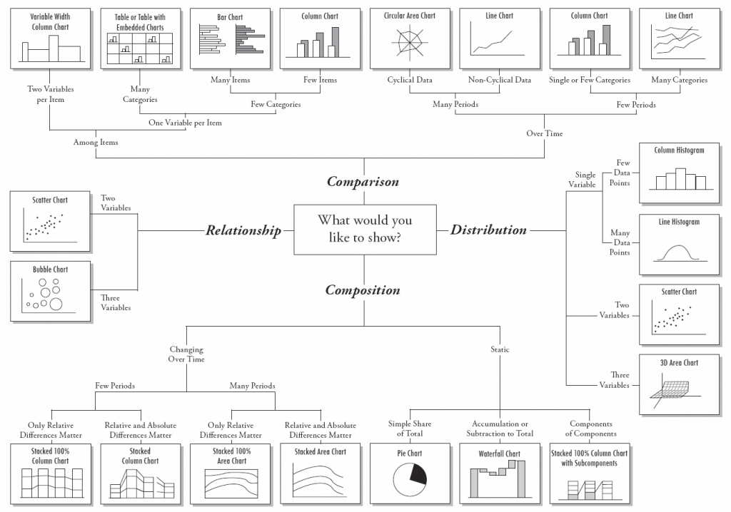
So make sure that you carefully choose the right visualization to present your data. Here is a diagram to help you decide the right visualization for each kind of data.

Also read : 3 principles of Good Data Visualization Design
4. Provide Context
Visualizations are effective only when they are viewed in the right context. For example, a 12% growth this year looks great, but it may not be a big thing if last year’s growth was 20%.
Look at the couple of visualizations below. Which one do you think is more intuitive and useful?

The chart on right is more informative than the one on the left, because it is more descriptive.
Here are a few simple tips to add the right context to your charts & graphs.
- Provide descriptive titles. “Monthly Sales growth in 2020” is better than “Sales trend”
- Add Axes titles
- Add data labels where possible
- Use tooltips that display information on hovering over a chart element
- Mention caveats and assumptions as footnotes
Also read : Key Financial Charts and Graphs for your business
5. Use Visual Cues
In addition to providing textual context, it is equally important to provide visual cues to make it easy for users to consume information. Here are a few tips to make your charts & graphs more intuitive.
- Display visualizations in a hierarchical manner on a dashboard/report, with the most important ones at the top, and the least important ones at the bottom
- Use same color to display elements of same category. For example, when you display sales trend, it is better to color all bars of the same color, instead of using same colors.
- Group similar charts & graphs together – by brand, product, location, or some other common factor.
- Use 4-5 colors consistently throughout all your charts & graphs.
Conclusion
Hopefully, the above data visualization techniques will help you analyze and visualize data effectively. Also, it is equally important to pick the right data visualization tool to easily convert data into insights. Otherwise, you may end up wasting a lot of time trying to create visualizations as per your requirement. If you are looking for an easy to use, affordable data visualization tool that allows you analyze data using drag & drop interface, and visualize them in more than 35 different chart types, try Ubiq.
Ubiq makes it easy to visualize data and monitor them in real-time dashboards. Try Ubiq for free.
Sreeram Sreenivasan is the Founder of Ubiq. He has helped many Fortune 500 companies in the areas of BI & software development.