Data visualization makes it easy to get insights and make informed decisions. However, if you design your visualizations properly then it can confuse your audience, instead of helping them. Luckily, there are a few simple data visualization best practices that you can follow to make your data visualizations intuitive. In this article, we will look at the key data visualization principles to keep in mind while analyzing data.
What makes a good data visualization
Data visualization is simply a visual way of communicating information. It helps people quickly get insights from a pile of numbers. A good data visualization is easy to understand, keeps the audience in mind and clearly communicates your message to the viewers.
Top 4 Data Visualization Best Practices
Here are the top 4 data visualization best practices to keep in mind while designing visualizations.
1. Understand Your Audience
One of the most important data visualization best practices is to understand your audience and design visualizations that helps them get information, answers and insights. User requirements can greatly vary depending on your target audience, and you will need to change data visualization from one audience to another. For example, a sales manager might be interested in looking at daily sales information, while a CEO will be interested in quarterly sales numbers. So ask the following questions before you start visualizing data
- Who will use this visualization?
- What information are they looking for?
- What decision do they need to make?
Once you understand your target audience and their requirements, it will be easier for you to present the right information in your visualizations.
Bonus Read : Key Financial Charts & Graphs
2. Choose the Right Visualization
Another key data visualization principle is to choose the right visualization. You can always present your data in multiple ways, some are more intuitive than the others.
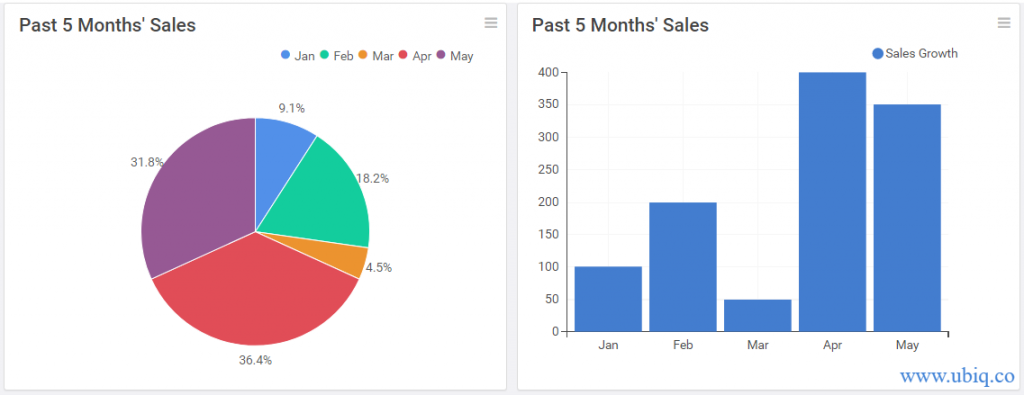
Your choice of visualization can help or hurt your audience. In which of the following graphs, is sales trend is easy to spot?

The sales trend is obvious in bar graph whereas the pie chart is simply confusing. The viewer will get lost between the pie slices and chart legend.
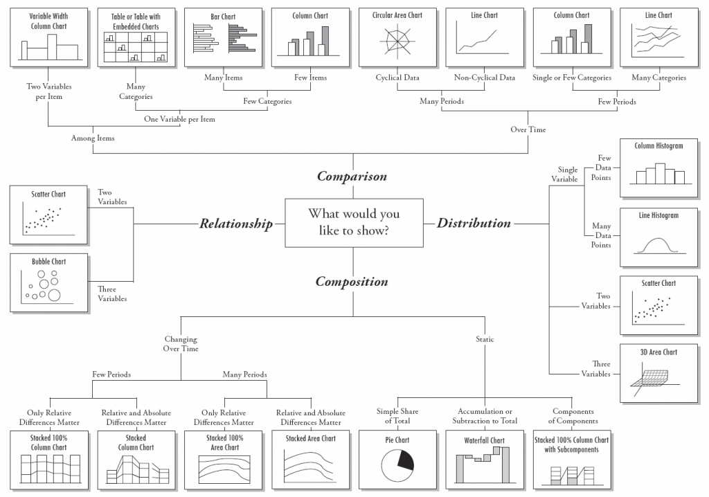
Here’s a simple diagram to help you determine the right data visualization, depending on the type of information you want to present.

3. Provide Context
10% growth in sales sounds like a good number. But is it relative to past month, or compared to last year?
Charts and graphs alone are insufficient to deliver insights to your audience. It needs to be conveyed along with the right context. Look at the two bar charts below. Which one is easy to understand?

The bar chart on the right is intuitive, thanks to its chart title, data labels and axis labels. So ensure that you present your data with the right context. Describe what your visualization is about, and mention any assumptions and caveats as footnotes. There are many simple and subtle ways to add context to your data visualizations using:
- Chart title
- Axes labels
- Data labels
- Footnotes
- Interactive Tooltips
Bonus Read : Top 5 Business Intelligence Tools
4. Keep it simple
Data visualizations and dashboards contain many visual elements such as colors, graphs and charts, and can be quite distracting, if not designed properly. So keep things simple so that they are easy to understand. This means
- Don’t use too many colors. Use 3-4 colors consistently across all your data visualizations on a dashboard
- Arrange visualizations in a logical manner – important summaries at the top, followed by charts for distributions & comparisons, and finally granular tables of data
- Place related visualizations nearby. For example, graphs pertaining to same product, brand or region can be arranged next to each other.
Hopefully, the above data visualization best practices will help you design intuitive dashboards & reports for your business.
Ubiq makes it easy to visualize data and monitor them in real-time dashboards. Try Ubiq for free.
Sreeram Sreenivasan is the Founder of Ubiq. He has helped many Fortune 500 companies in the areas of BI & software development.