Visualization Types
We have 18 interactive visualizations to help you plot your data! They show tooltips on hover & have auto scale for axes. You can even customize the axes labels & format. For chart customization, please refer to Chart Customization. Smart axes auto adjust based on the range of values. Also, if the axes values auto rotate in case of long texts.
Following types of visualizations are available.
-
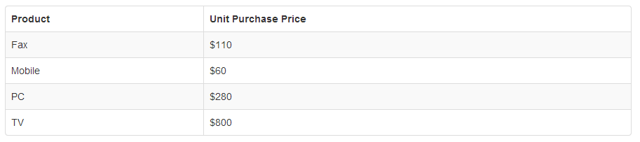
Data Table
-
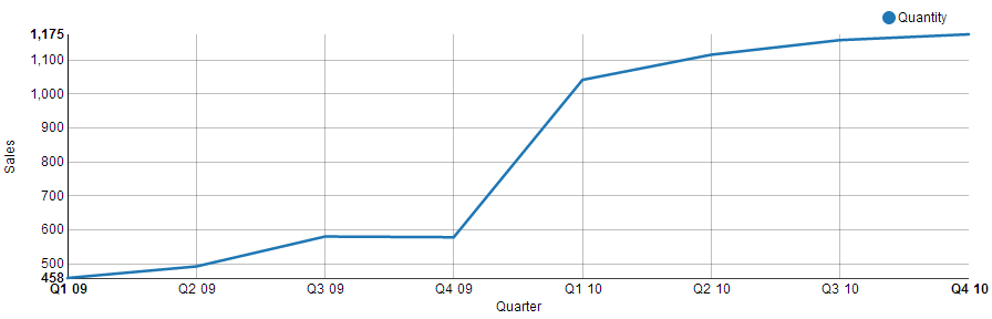
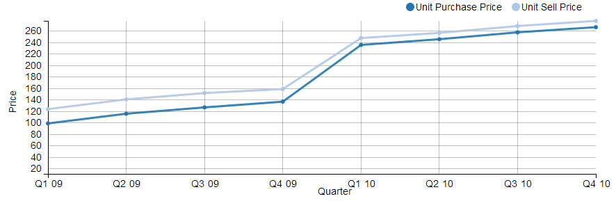
Line chart
-
Stacked Line chart
-
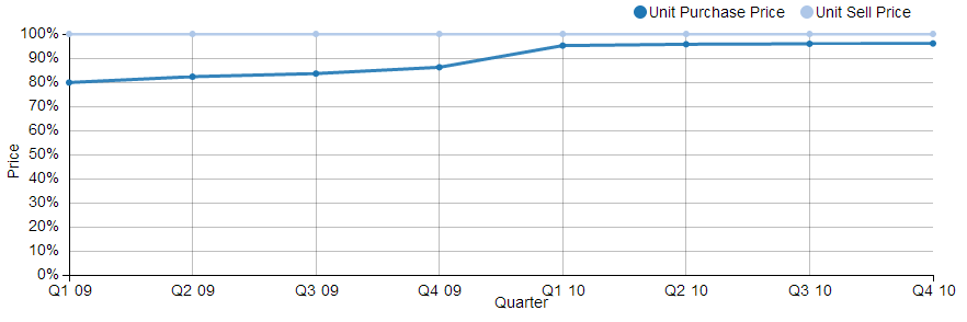
Percent Line chart
-
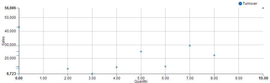
Scatter Plot
-
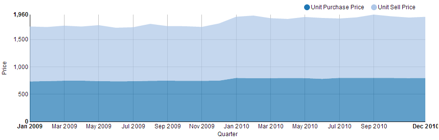
Stacked Area
-
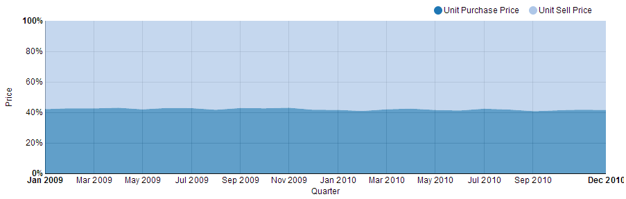
Percent Area
-
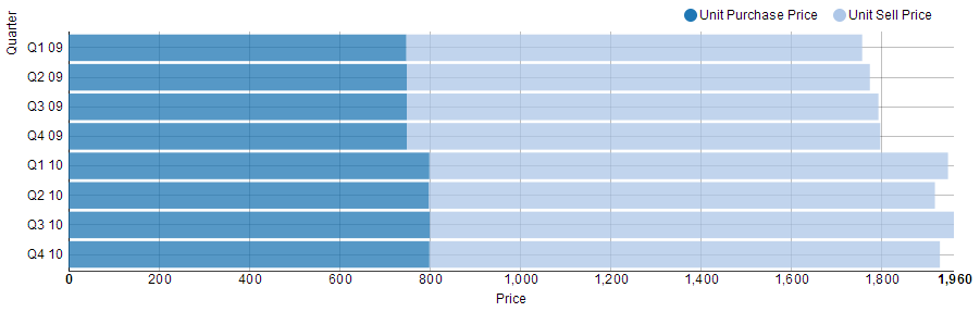
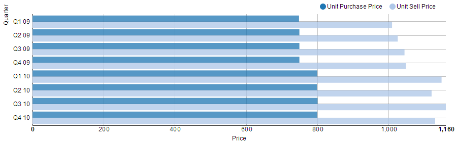
Stacked Bar
-
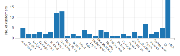
Grouped Bar
-
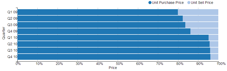
Percent Bar
-
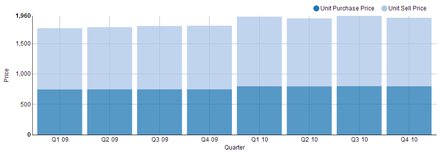
Stacked Column
-
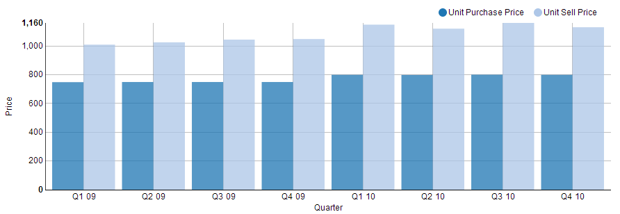
Grouped Column
-
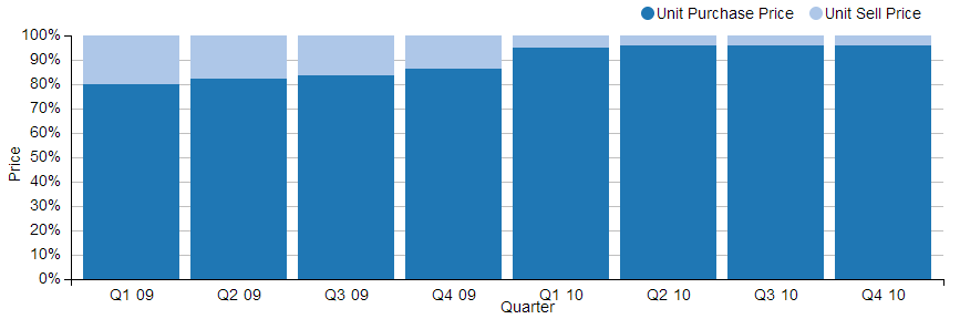
Percent Column
-
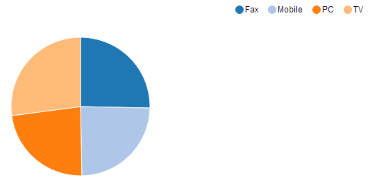
Pie Chart
-
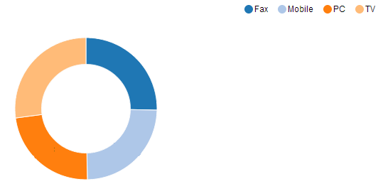
Donut Chart
-
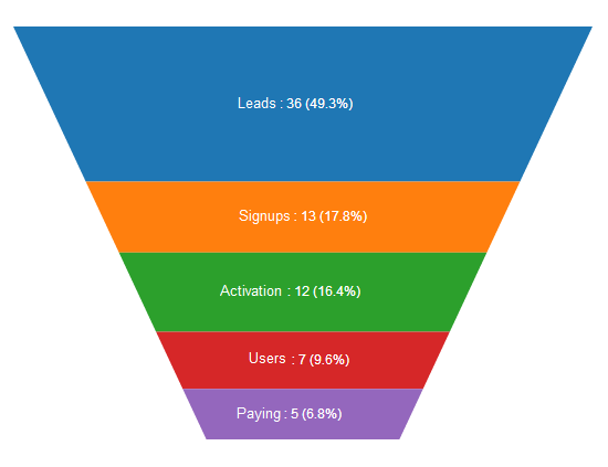
Funnel
-
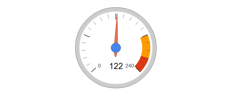
Gauge
-
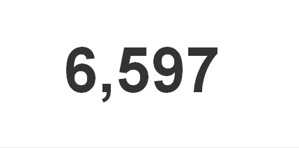
Number
For live examples, please refer to Live Dashboards