
Dashboard design tips can help you improve your dashboard design and create intuitive dashboard design UX for your users. Here are the key dashboard design best practices to help improve your dashboard design.
How to Improve Your Dashboard Design
Here are some simple and easy ways to quickly improve your dashboard design for your users.
1. Know Your Audience
One of the most important ways to improve your dashboard design is to clearly understand what your users want and give it to them. Meet your target audience and find out:
- Who will use your dashboard?
- How will it help them? Will they use it to monitor existing operations? Discover new ideas?
- What metrics & KPIs would they like to view in them? You will need to strike a trade-off between what they want to see and what you are able to display with available data
- How frequently would they view your dashboard? This will tell you how frequently the dashboards should be updated
- Ask them to share copy of their existing reports & dashboards? This will give you a starting point
- What improvements would they like to see in their existing dashboards?
Document these reporting requirements and get a sign off from key stakeholders so that you can freeze those requirements.
Bonus Read : Key Website Performance Metrics & KPIs
2. Display only Relevant Metrics
One of the simplest ways to improve your dashboard design is to display only metrics & KPIs that are relevant to your audience. Don’t display more than 10-15 metrics per dashboard.
If there are more metrics & KPIs to be reported, move them to an auxiliary dashboard.
Even when you display each metric, show information at the right level of granularity and reporting period. For example, an executive might be interested in quarterly sales summary, while an operations manager will be looking for day-to-day sales numbers for the past 2 weeks. If you don’t take this into consideration, users might find your dashboards to be irrelevant.
Also, if you have diverse users (e.g managers, analysts, developers, etc), then it is better to design separate dashboards for each user group, instead of designing a common dashboard that clubs all their metrics together.
Bonus Read : What to Include in Executive Dashboard
3. Choose the Right Visualization
One of the most critical dashboard design best practices is to use the right visualization to present your data. Otherwise, it might confuse or even misguide your users.
Here’s an example. Both the visualizations below show the same data. In which of the following visualizations, can you spot a sales trend?
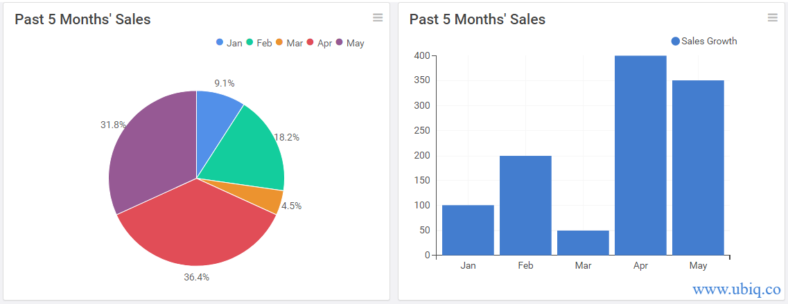
The sales trend is obvious in the column chart, on the right. In case of pie chart, the user will end up wasting quite of a lot of time figuring out what each slice means. Further, it will be difficult for users to compare pie slices and decide the sales are rising or falling.
Bonus Read : Top Call Center KPIs & Metrics for Customer Support
4. Organize Your KPIs Logically
While arranging metrics & KPIs on your dashboard, place the most important ones at the top, followed by trend and comparisons in the middle, and detailed data tables at the bottom. This will help users quickly grasp the gist of your dashboards, and delve into details as they scroll down.
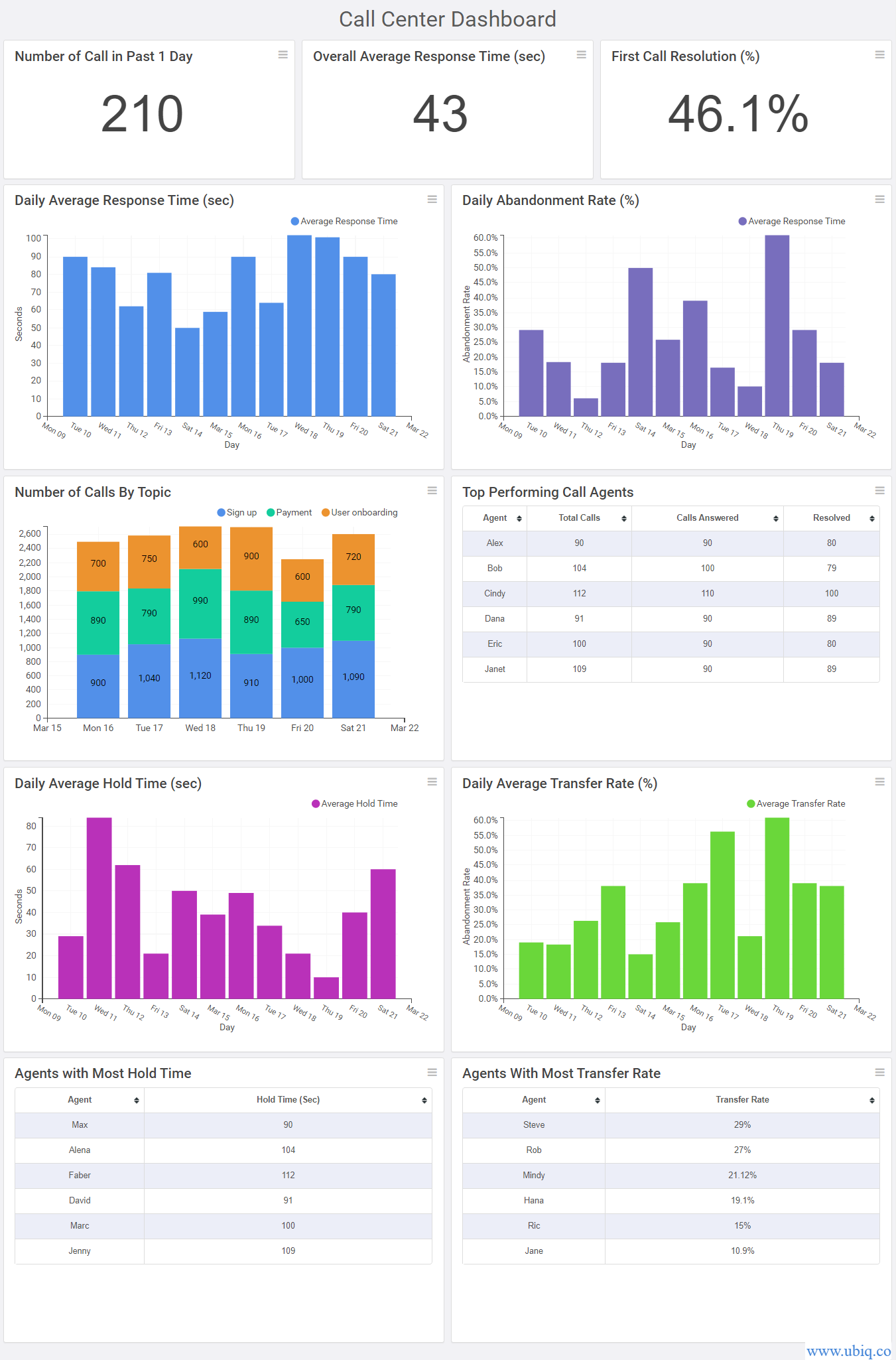
Also, you can make dashboards a lot more intuitive by simply placing related metrics next to each other. Here’s an example of a dashboard built using Ubiq dashboard software
5. Use Minimal Colors Consistently
Dashboards are visually distracting due to many charts and colors. So try to use as few colors as possible to focus user attention to where you want it to be.
Pick a dashboard color palette and consistently apply it across all your metrics. If you use too many different colors, users might think they are unrelated.
In fact, you can also use same colors to imply similar or related metrics. Here’s an example of a dashboard created using our data visualization tool.
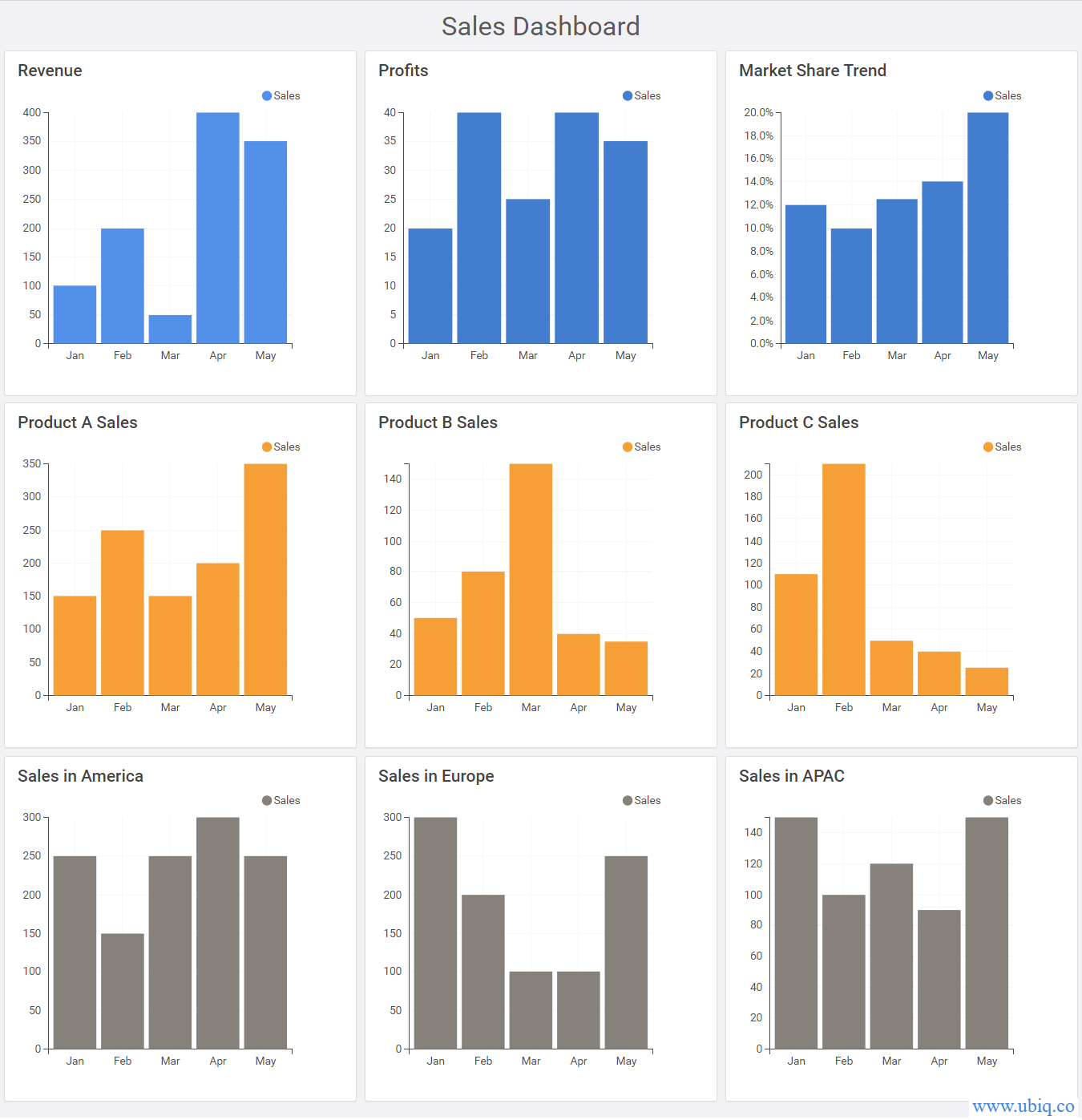
Logical placement of metrics, and use of colors to group related metrics, allows users to easily understand your dashboards.
After you design dashboards, make sure that you clearly communicate how users can read your dashboards via an email/presentation. Explain their layouts and what each graph/table stands for. This will help users understand the reporting context and make better decisions faster.
Hopefully, the above dashboard design tips will help you improve your dashboard design. If you want to create business dashboards, reports & charts, you can try Ubiq. We offer a 14-day free trial!